Improving virtual account completion rate through better UX and data insights
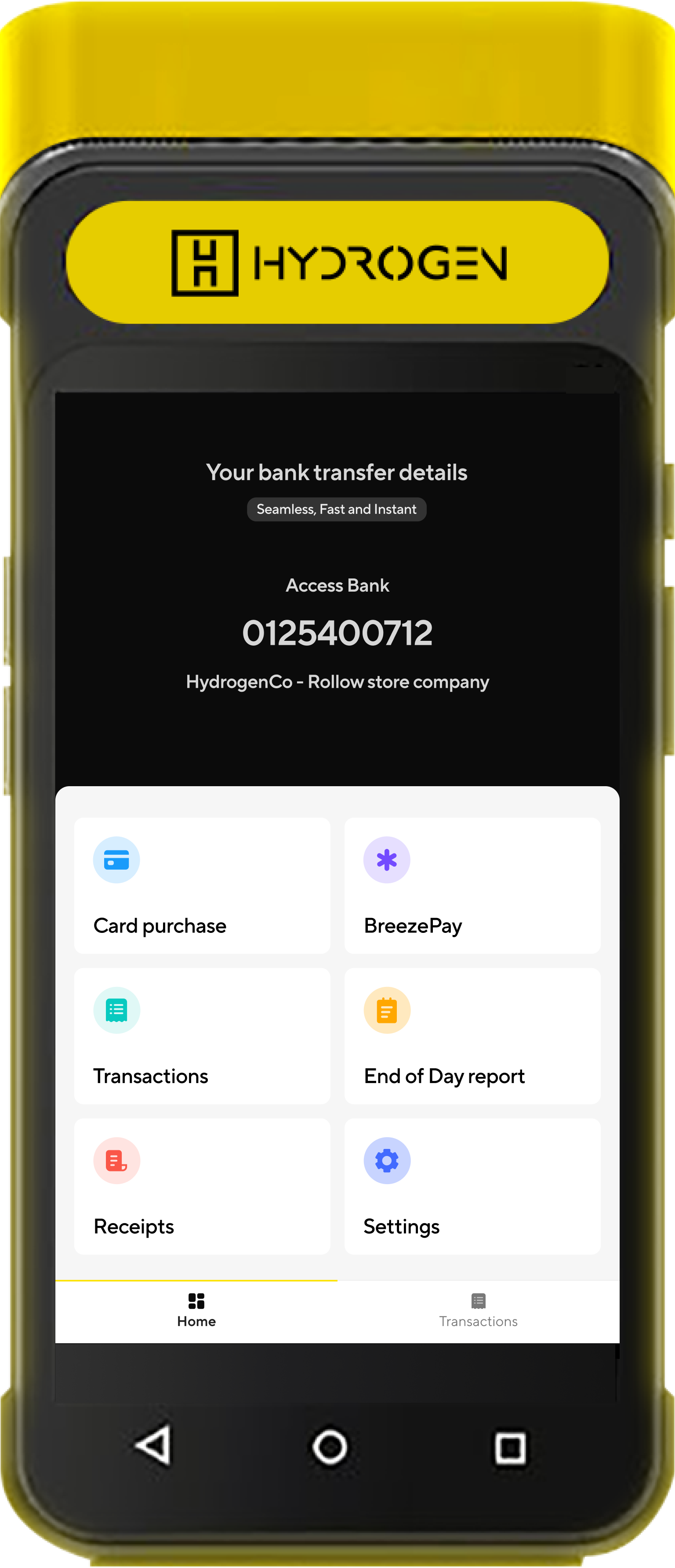
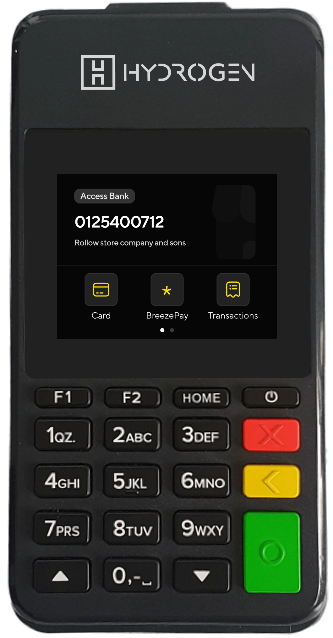
Instantpay allows merchants to open virtual bank accounts in seconds – accounts they use to collect and track business payments.
- Role: Product designer, User Researcher
- The team: Product manager, mobile & backend developers, QA tester, product designer
- Year: 2025
💡 Context
Merchants use Instantpay to collect and track payments across their business. The generation flow is simple- assign a label, optionally assign it to the right outlet or staff, and start collecting payments.
The system is built around three entities:
- Accounts: virtual bank accounts for business payments.
- Locations: outlets or points of sale.
- Users: staff who manage or monitor collections.
Each account may link to a location and one or more users, giving merchants control over access and visibility.
In practice, though, this flow wasn’t always seamless. Merchants who needed to assign accounts to new locations or staff had to leave the setup, create them elsewhere, and start over- breaking the promise of an “instant” experience
🎨 My Role
I worked on this project as a Product Designer and Product Analyst, collaborating closely with the Product Manager and Engineering team.
My responsibilities included:
- Analyzing Mixpanel data to uncover usability and engagement patterns.
- Identifying pain points in the virtual account creation flow.
- Redesigning the experience to make the process more intuitive and self-contained.
- Coordinating solution feasibility discussions with developers to ensure a technically sound and scalable fix.
At the time, there was no defined project goal- I initiated this work while monitoring user behavior to uncover opportunities for improvement.
Understanding the System
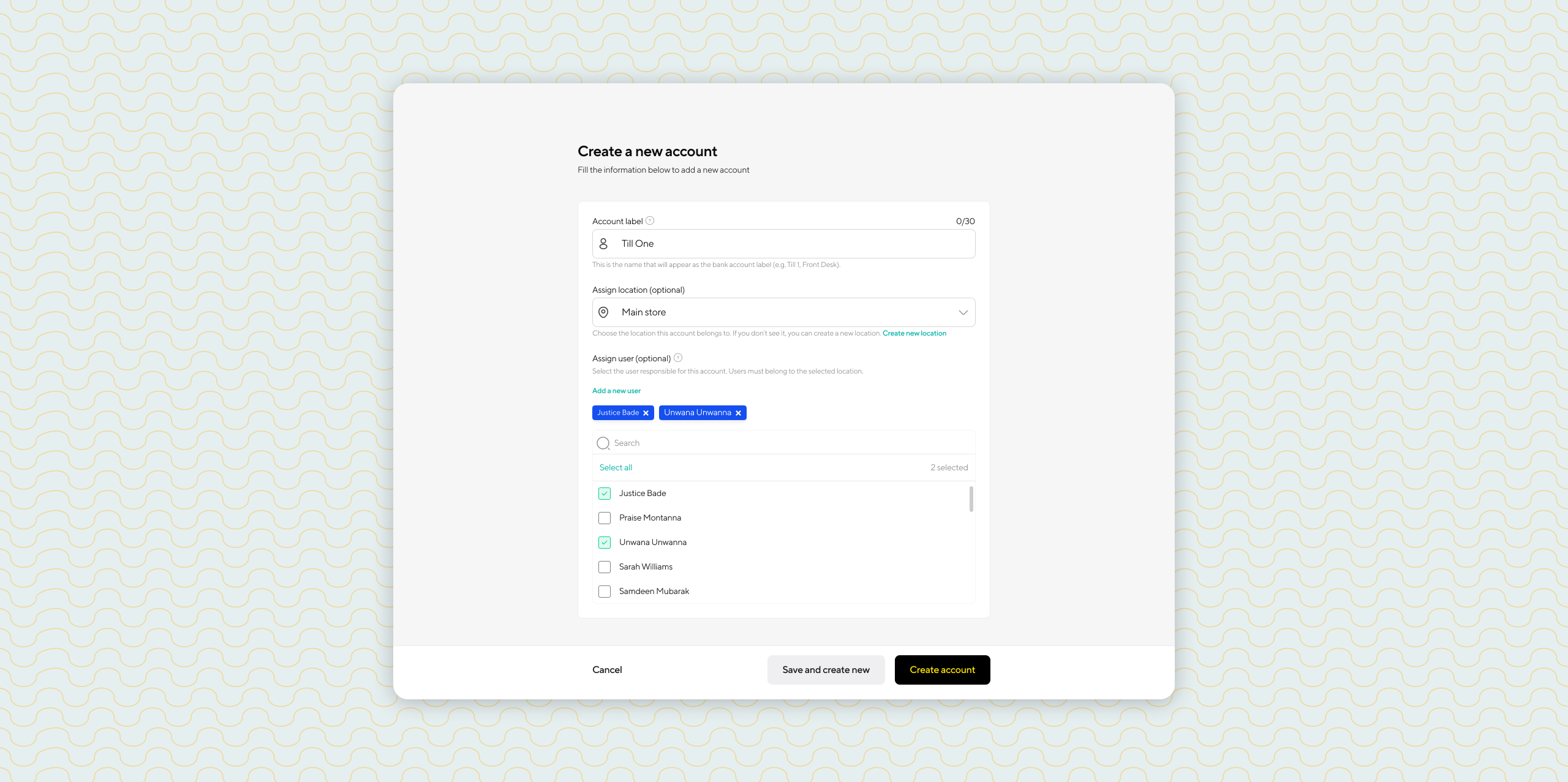
The virtual account creation flow was designed to be quick and simple and straightforward.
When a merchant clicked “Create Virtual Account,” a short form appeared with three fields: Account Label, Location, and User(s), followed by two actions — Create Now or Cancel.
The problem arose when merchants tried to assign the account to a new location or user that didn’t already exist. There was no way to create them within the flow, forcing merchants to cancel, navigate elsewhere to add them, and then restart the process.
For merchants managing multiple staff or outlets, this interruption created unnecessary friction and slowed down their workflow.
Spotting a Pattern in the Data
A few weeks before uncovering this issue, I had just led and completed the implementation of Mixpanel tracking across several products in the organization– including Instantpay.
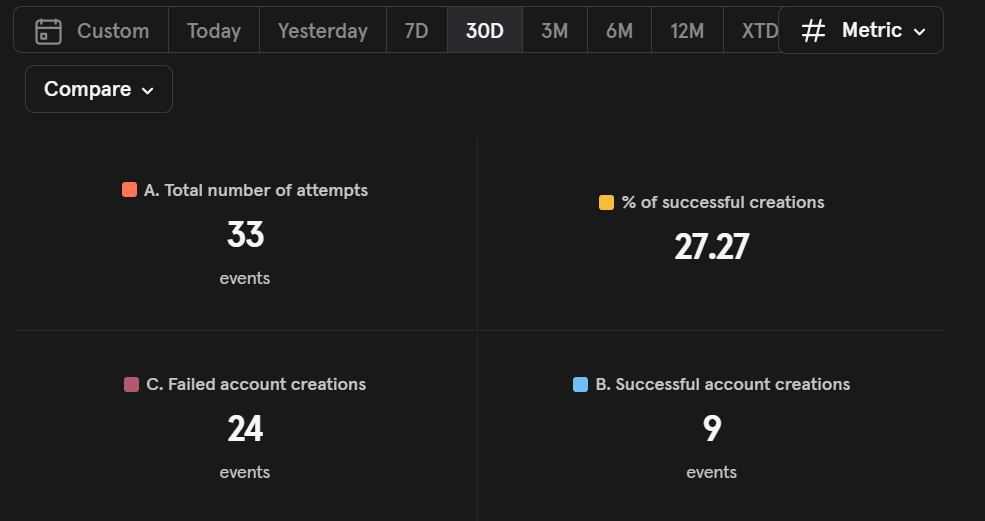
While reviewing the new event data for the virtual account creation flow, one metric immediately caught my attention:
Failed account creations were nearly three times higher than successful ones.
This was alarming because the flow was designed to be fast and simple.
For a financial tool built on intuitiveness and simplicity, this friction was costing both user confidence and potential revenue. Each failed attempt meant a merchant couldn’t create an account, which delayed onboarding, slowed transaction growth, and reduced trust in the product’s reliability.
Quantitative Signals
In Mixpanel, a virtual account creation event is triggered as soon as a user clicks the “Create Virtual Account” button.
I defined a “failed creation” as any of the following:
- The user canceled before completion
- The flow started but no account was generated
- Or the event logged a failure reason such as:
+ user_cancelled
+ network_error
+ server_error
To understand the pattern, I analyzed the flow report to identify what users did next after canceling the process – most of them navigated directly to the Locations or Users page.
Qualitative Follow-up
To move beyond the numbers, I exported a sample of merchants with the highest cancellation rates and, together with the Product Manager, conducted short interviews to understand what was happening.
The findings were clear: merchants didn’t find the flow intuitive. Many expected to set everything up – account, location, and users – in one go. Having to leave the flow just to create a new location or user felt unnecessary and interrupted their momentum.
In short, the system logic worked, but the experience didn’t align with how merchants naturally wanted to work.

Design Process
The design effort was guided by data and user feedback rather than broad exploration. The goal was to close the gap between intent and completion by keeping users fully engaged within a single, seamless flow.
Through insights from user interviews and Mixpanel data, it became clear that merchants didn’t want to leave the account creation screen just to add a new location or staff member. They wanted to stay in context and complete everything in one go.
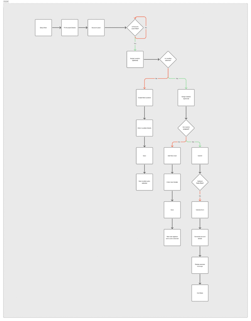
The solution was inline creation via modals – allowing users to create missing locations or users directly within the flow. This approach preserved continuity, reduced friction, and made the experience feel faster and more intuitive
Inline Creation via Modals
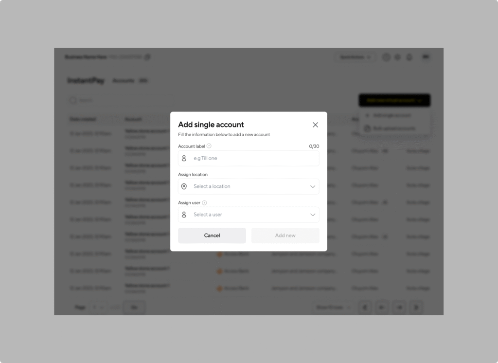
Merchants can now create new locations or users directly from the virtual account creation screen without losing progress.
When they realize a required entity doesn’t exist, they simply click “Add new”, fill a small modal, and return seamlessly to the flow.
This avoided the back-and-forth navigation that caused the original cancellations.
Add a new location
Add a new user
Helpful Copy and Guidance
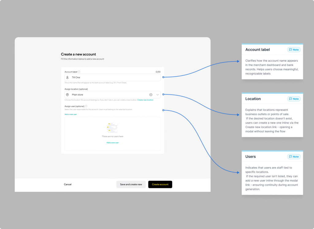
I optimized the microcopy across the form to anticipate confusion and gently guide users toward understanding.
These micro-explanations reduced uncertainty and eliminated the trial-and-error behavior that often led to frustration.
Default “Main” Location
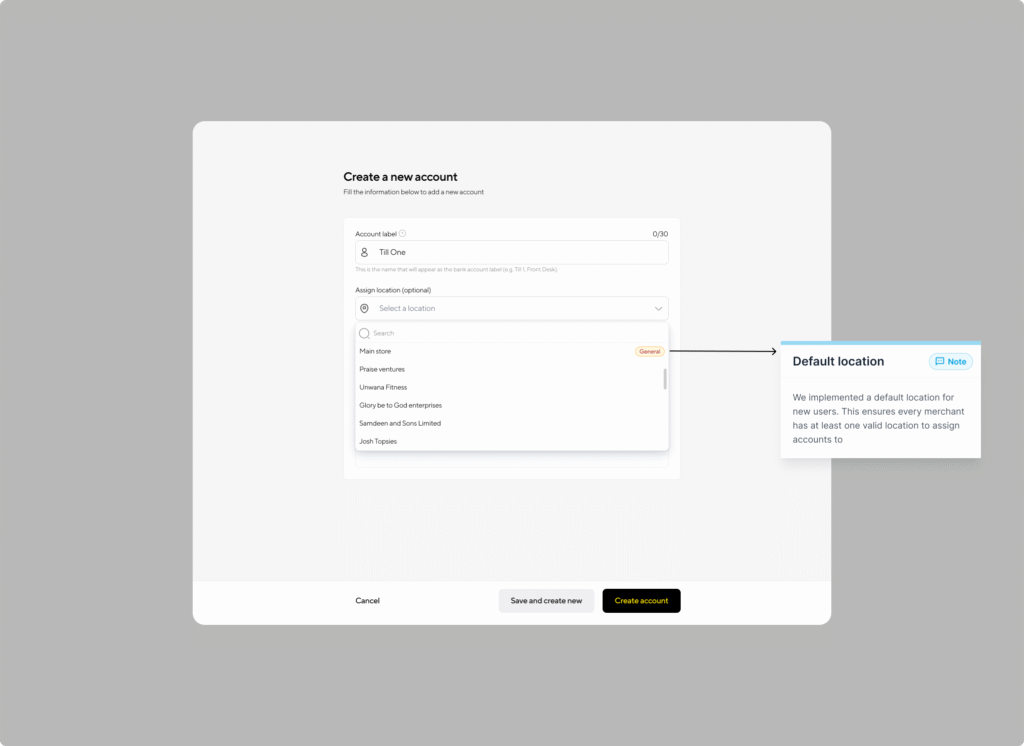
For new merchants, the app now automatically generates a default location called “Main.”
This ensures every merchant has at least one valid location to assign accounts to – simplifying the setup process, especially for first-time users.
Impact
While I’m still compiling final figures, early metrics and feedback indicate clear improvements
-
Cancellation rates dropped significantly, leading to higher completion rates.
-
Merchant feedback highlighted appreciation for the inline creation and default “Main” location.
