Hydrogen
Redefining merchant success: solving growth challenges with a custom POS solution
At a glance
HydrogenPay initially had a whitelabel POS solution in the market that allowed merchants to accept card payments in-store and retail environments. While this solution helped gain traction and acceptance, it slowly introduced a series of limitations that stifled the company’s ability to scale, innovate, and meet customer and business needs.
To address these challenges, we decided to develop an in-house POS system that offered greater control, flexibility, and compliance with industry standards as well as introduced new tools to further empower merchants run their business
As the lead product designer, I owned the entire product design end-to-end, as well carried out design quality tests on physical pos device. I worked very closely with the product owners and software development team.
My Role
Product Designer — Interaction Design, User Flows, Rapid Prototyping
User Researcher
Team
Product manager
Mobile developers
QA tester
Product design
Deliverables
Product Design, Interaction Design, User Flows, Rapid Prototyping, user research
Tools
Figma, Figjam
Key metrics
Over 10x
average daily merchant revenue
65%
drop in customer queries
38%
rate in cross feature adoption
45%
faster in erp system integration
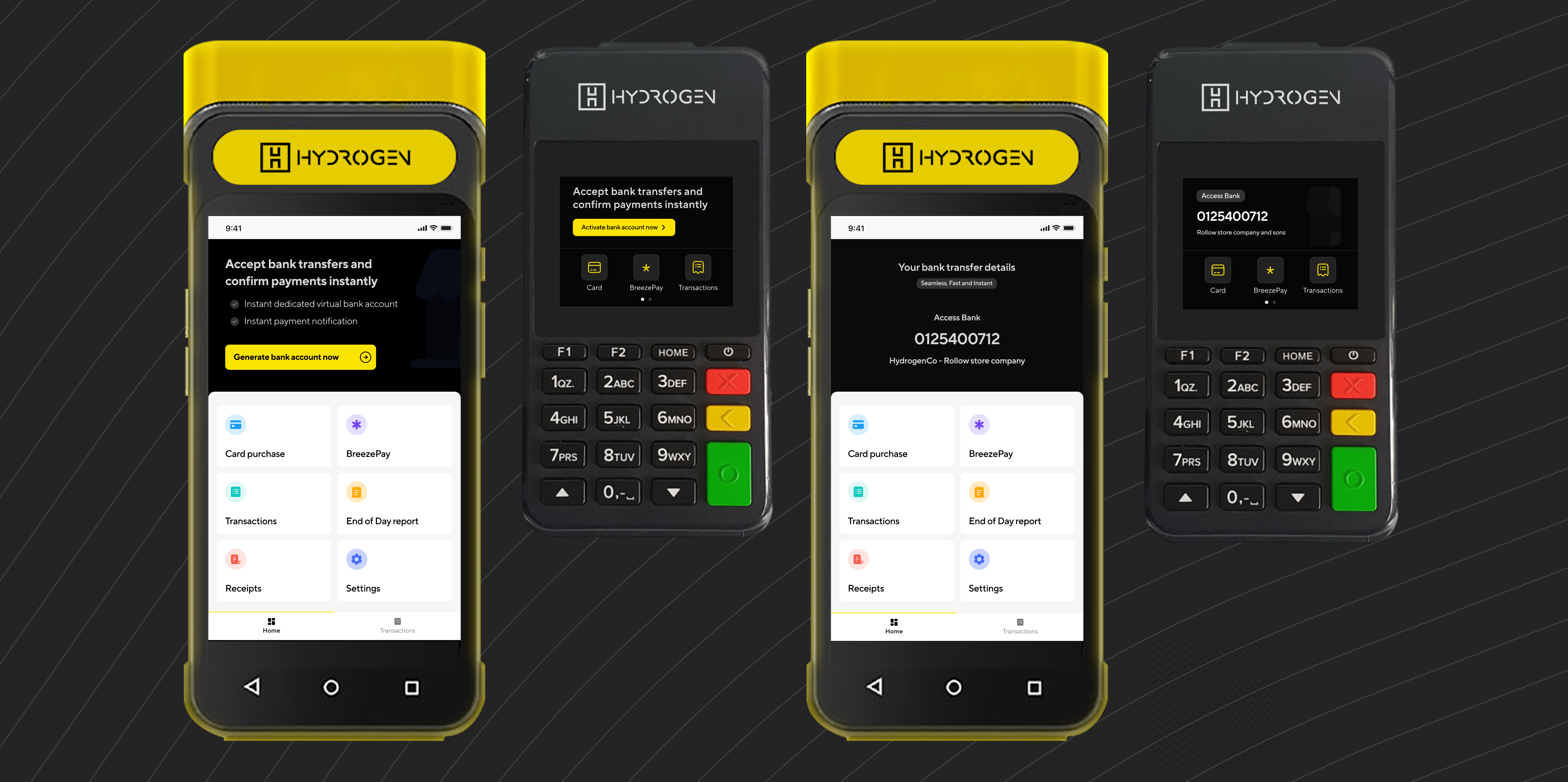
Table of Contents
The challenges
-
Third party SDKs were rigid and were limiting us in how we could deliver both customer demands and industry standard
-
Customer support was always bombarded with countless similar tickets and requests
-
The company was struggling with a CRM system that could validate merchant configuration and data
-
Reliance on vendor's development cycles and lack of innovation. Meaning if we needed a feature, we'd get it if it's on their current roadmap
-
The need to market a product that complies with industry regulations
Shadowing merchants
Designing the new POS required a deep understanding of the physiology and psychology needs of our users. At the early stage of user research, I paid visits to some of the local vendors and mall checkout points to ask questions and also observe how they use the POS in different scenarios. (PS: I made friends with some of the merchants and mall cashiers)
The top insights gathered from the research includes
Lower satisfaction with current solutions
POS devices issued by banks have either clunky interfaces or a lot of unnecessary steps that increases time to checkout
Reconciliation is priority
Merchants needed an easy way to compare manually written financial records to statement to ensure all transactions are accounted for
Minimal cognitive load
Busy merchants need systems that reduce cognitive load during usage
Ease of use
Merchants often have busy environments where precision and speed are essential, and need a system that is quick to learn and use with minimal training
Brainstorming for users mental model
Our core users include mainly direct to consumers businesses such as retail stores, supermarts and malls, convenience stores, utility and hospitality services. Due to their exposure to modern tools, my strategy was to design an experience similar to their mental model on collecting payments.
I broke down the insights which led to some how might we questions to frame challenges and uncover opportunities for immediate customer impact.
How might we
streamline the checkout process so merchants can complete transactions faster even during peak business hours?
How might we
ensure intuitive and adaptable interactions from task discovery to completion
Heuristics matter
Two major considerations that influenced the design decisions were based on observations gathered from spending time with merchants. These helped me ensure the solution was practical and user-friendly
Context-aware interface
Many merchants struggled with visibility when using compact devices in bright, sunny environments. They often resorted to squinting or shielding the screen with their hands to view it properly
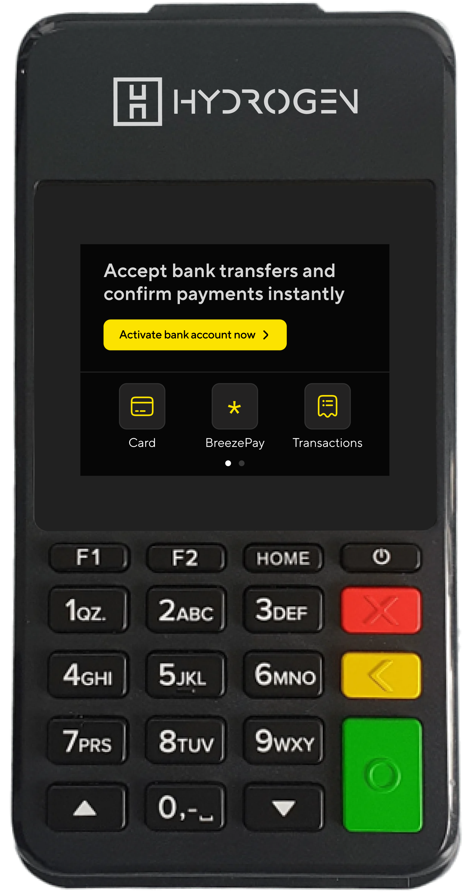
I implemented both dark and light screen modes where appropriate, ensuring the interface remained clear and accessible in any lighting condition.
One handed navigation
Because of how compact some devices were, users were fond of using one hand to operate them.
To compliment this, I also designed a logical layout that allows single thumb navigation
Hi-fidelity screens
My aim was to craft and design an intuitive and smooth user flow from task discovery to completion. Each step in the process should be streamlined and predictable, reducing the need for frequent error recovery
Home screen
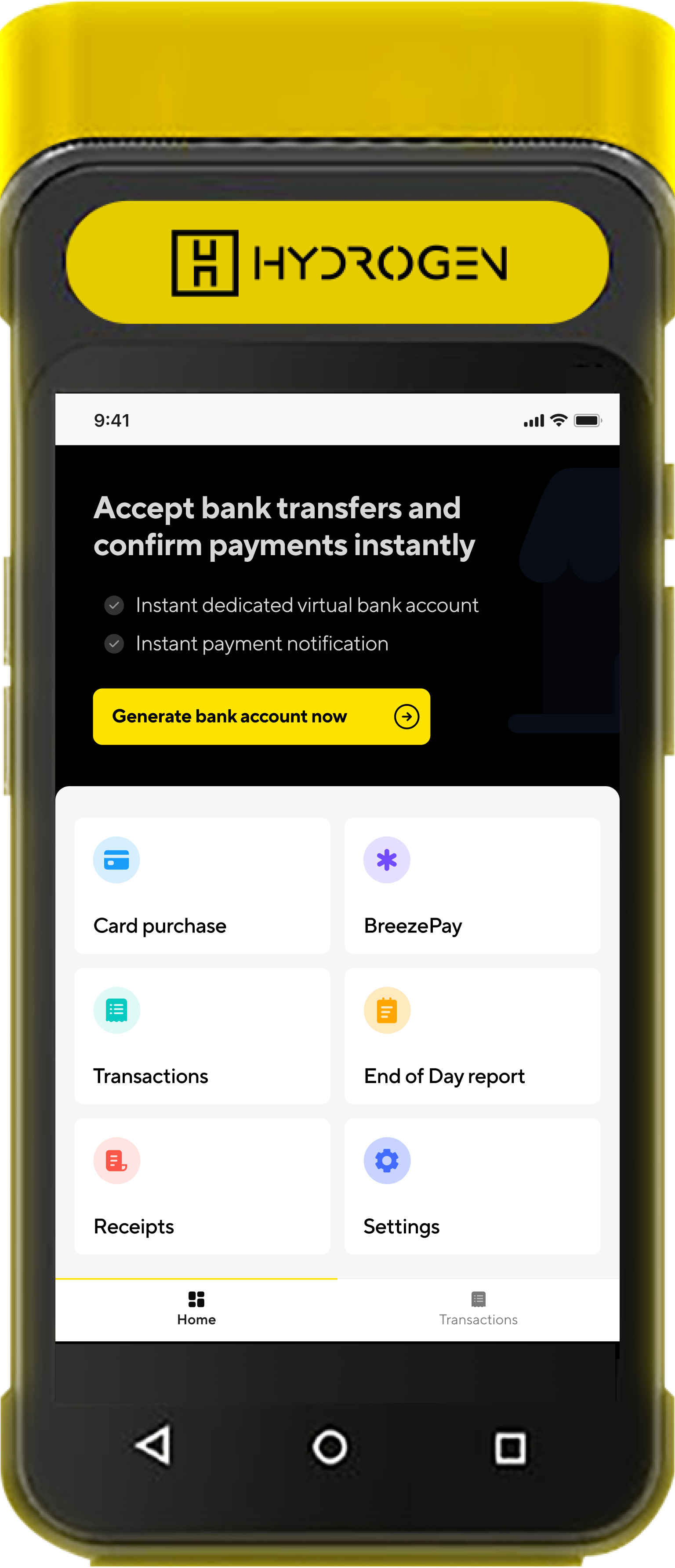
I designed a home screen where merchants could easily access their most important tasks- accept card payments, view transactions, view end of day report and also print out receipts when needed.
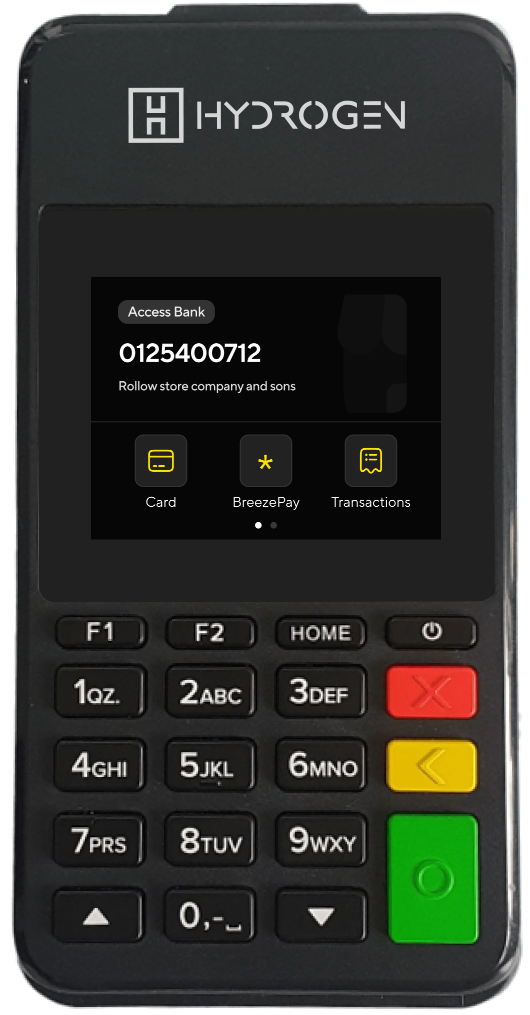
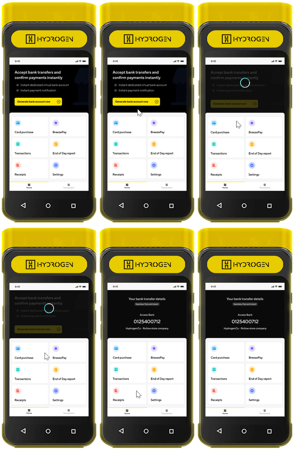
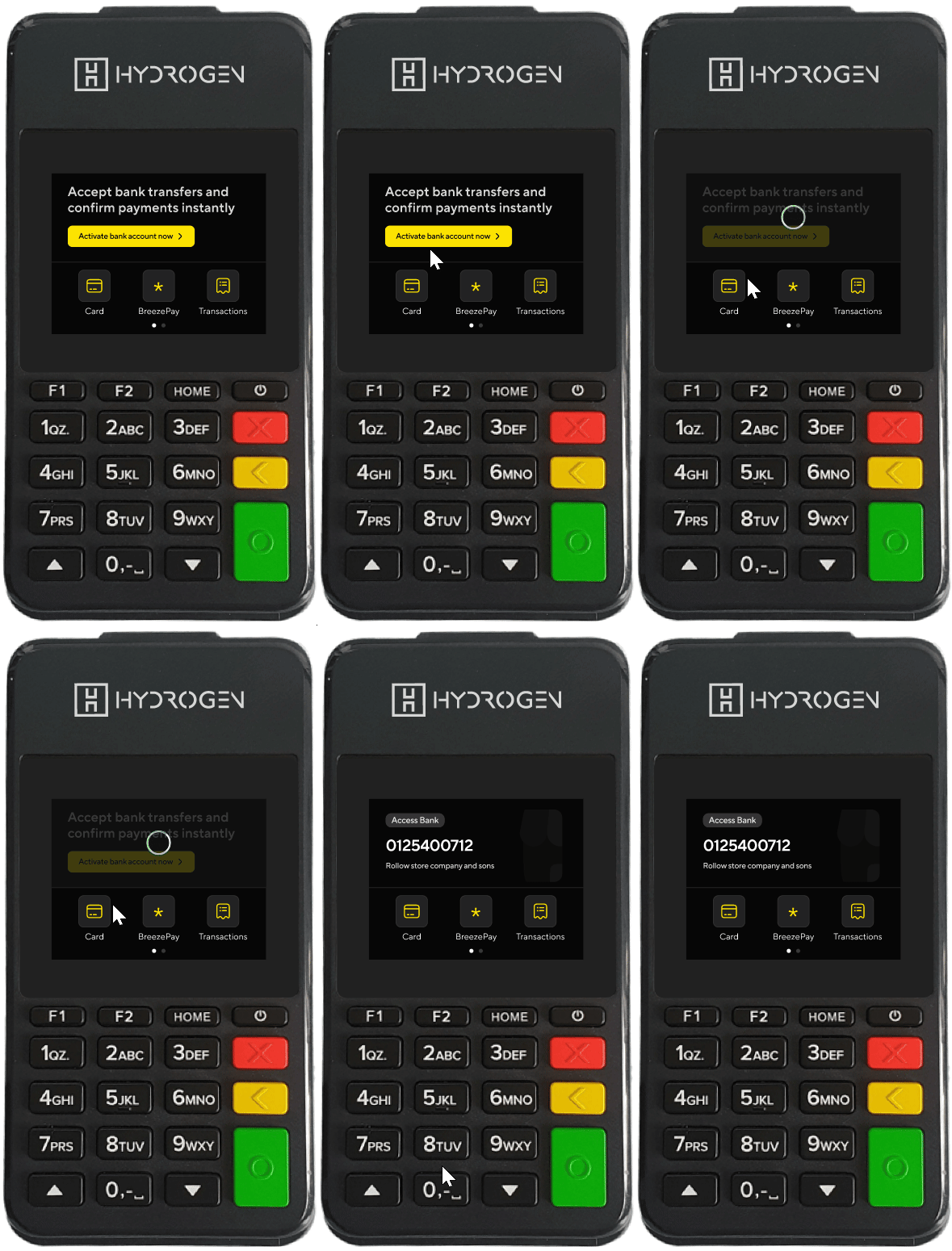
Virtual accounts in minutes
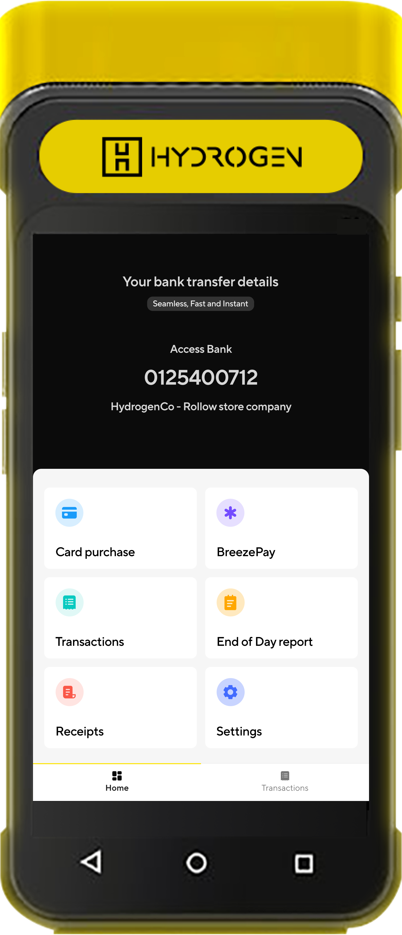
HydrogenPay POS empowers merchants to accept both card payments and bank transfers seamlessly. With just the tap of a button, merchants can generate a virtual bank account for quick and secure bank transfer collections from their customers.
Business bank accounts were powered by another product called InstantPay
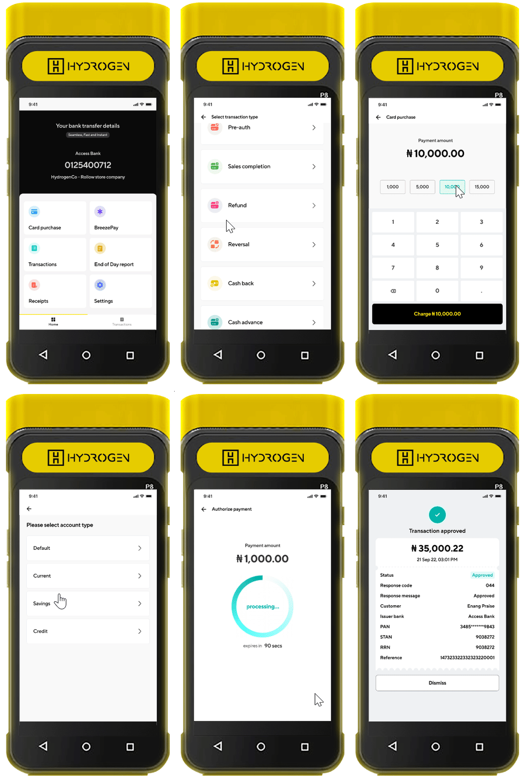
Expanded Card Transaction Options for Merchants
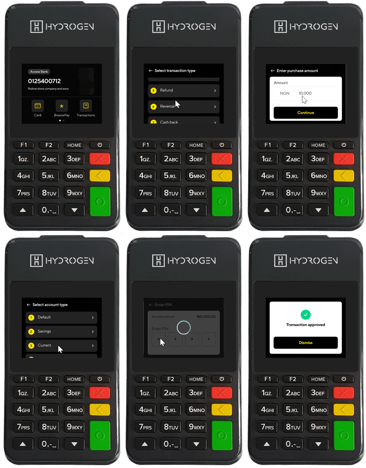
HydrogenPay POS allow merchants to perform advanced functions like issuing refunds and reversing transactions, meeting industry standards and ensuring that merchants had the tools they needed to manage payment issues efficiently
Transactions as they happen
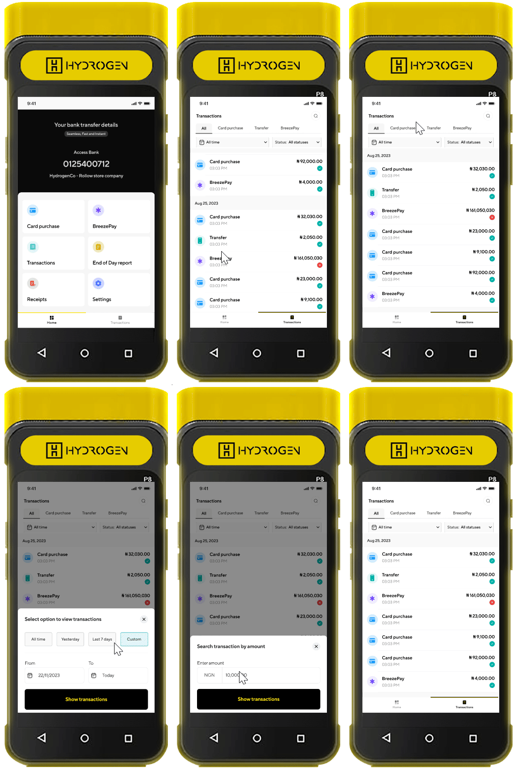
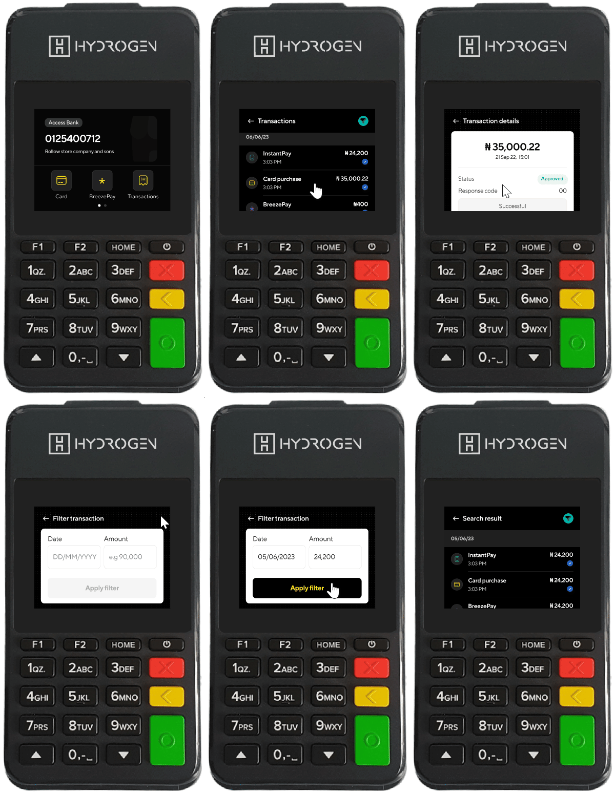
Merchants can check and verify transactions as they happen. We also added an easy way to locate transactions which greatly improved the merchant experience
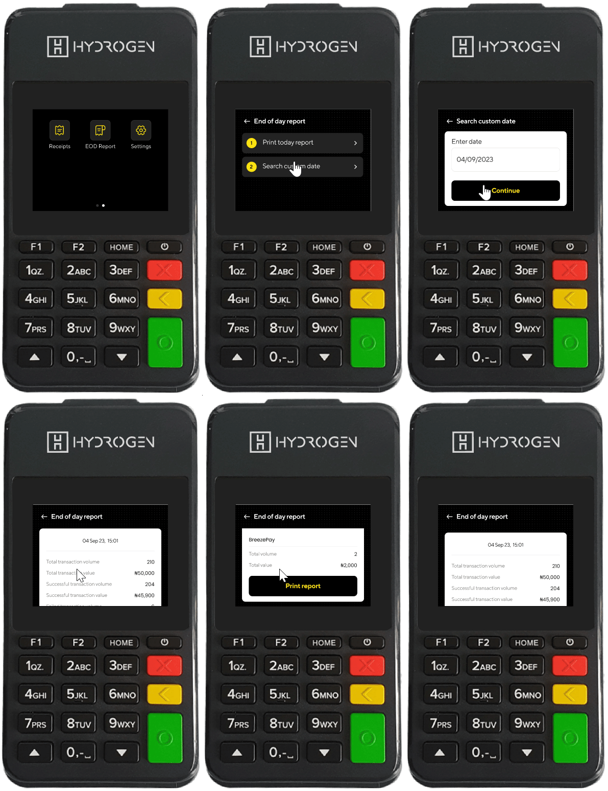
End of Day report
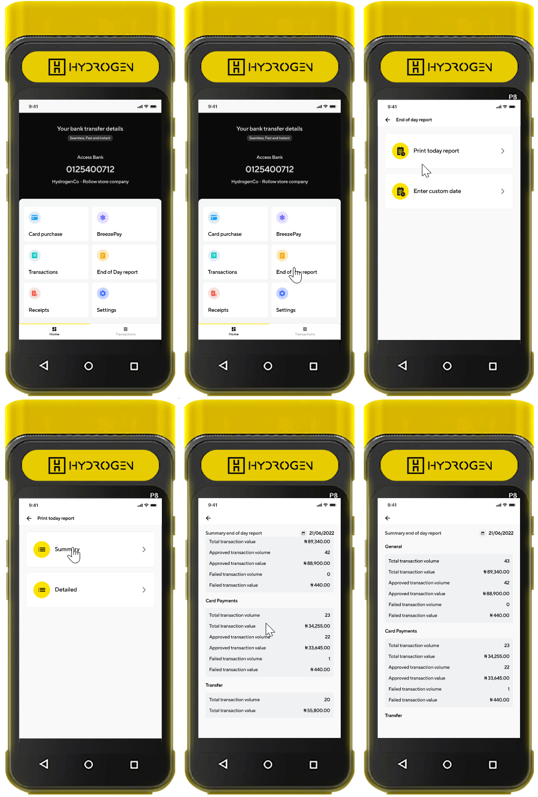
We provided merchants with end-of-day reports, allowing for easy reconciliation of transactions. This automation saved time and reduced the risk of manual errors in tallying payments at the end of a business day
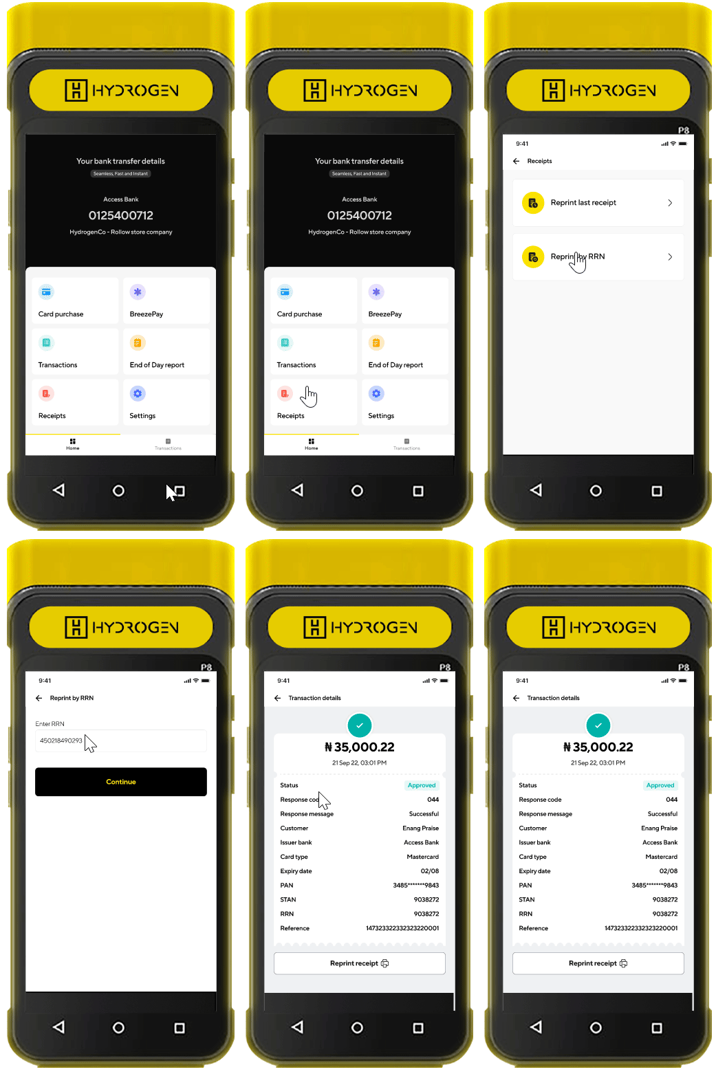
Receipt
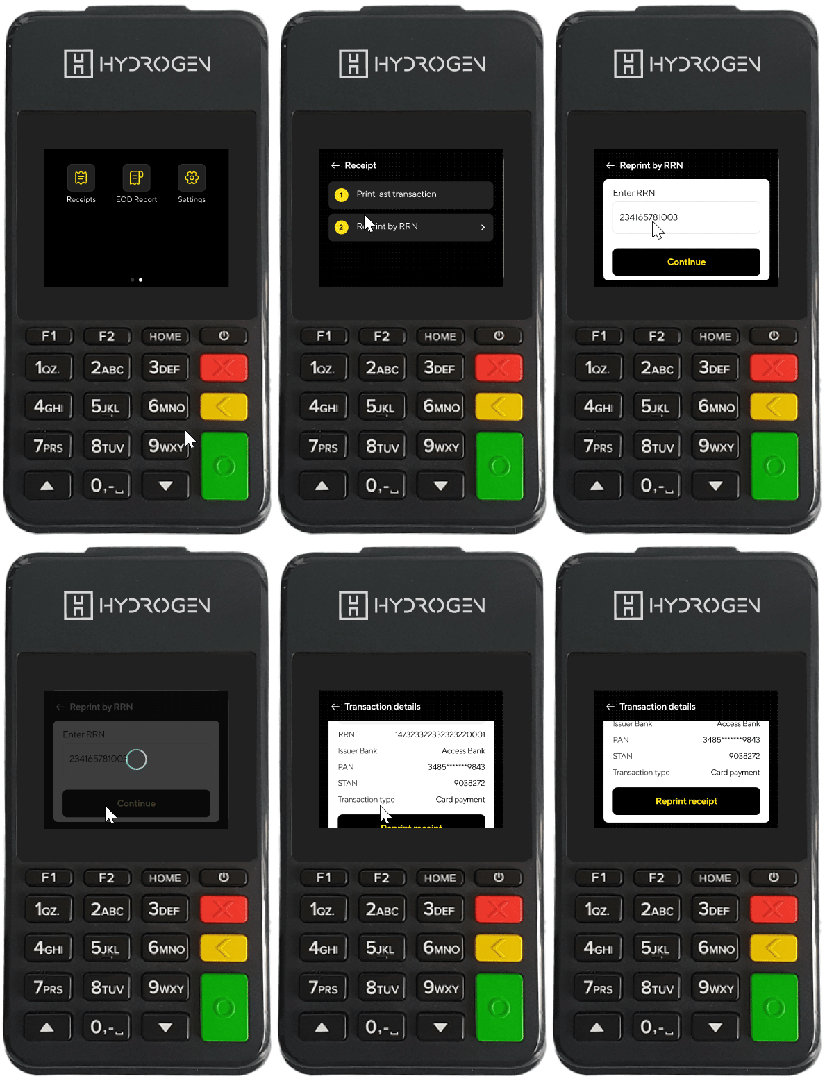
Merchants can print out receipts for the most recent transaction or print a specific transaction via its Retrieval Reference Number (RRN)
Design quality and usability
A key role I played during development was assisting the QA tester in making sure we shipped only quality implementation. The company sent me all models of the POS devices we worked on.
After a sprint, the developer would send me the latest apk release which I’d install on the physical device and gave suggestions and corrections where needed. This also ensured that designs were implemented according to company’s standard.
Having the device also made usability testing easy as I always tested with real life merchants and got feedback in real time
Reflection
A lot of actionable data and insight can be gotten from observing users in their natural state of usage. Immersing ourselves in the merchants’ day-to-day operations helped me design flows that genuinely met their needs.
Designing for physical POS devices meant we had to focus on making the interface touch-friendly and layout-efficient, keeping hardware limitations in mind. This experience underscored how crucial it is to create adaptable, user-friendly designs that work seamlessly across different device environments
Building a POS system demanded tight collaboration between design, product, engineering, compliance, and customer experience teams. This project highlighted the importance of clear communication and aligning goals across departments to deliver a cohesive product.