
Designing Neo: A smarter, faster POS experience for every business.
Neo is HydrogenPay’s next-generation payment solution. Designed for SMEs and large corporations, it delivers sleek POS terminals for fast, reliable in-store payments. For institutions, Neo extends beyond hardware, offering software and SDKs that integrate seamlessly into ERP systems — ensuring payments fit naturally into existing workflows.
- Role: Product designer, Interaction design, User Researcher
- Theteam: Product manager, mobile & backend developers, QA tester, product designer
- Year: 2023
💡 Background
HydrogenPay’s entry into the POS market began with a white-label solution that enabled in-store card payments. While it helped gain early traction, key challenges soon emerged – limited control over the vendor’s roadmap, slow feature delivery, repetitive support tickets, CRM incompatibility, and rigid SDKs that hindered adaptation.
The opportunity was clear: if Hydrogen wanted to scale, innovate, and maintain compliance, it needed to own its POS experience. That realization gave birth to Neo, Hydrogen’s first in-house POS product.
🎨 My Role
As Lead Product Designer on Neo, I owned the end-to-end merchant experience — from research to implementation.
- Conducted field and competitive research
- Led design ideation and built a lightweight component system
- Conducted quality assessments on POS devices each sprint to ensure consistency and quality
📊 Key Metrics
Over 10x
average daily merchant revenue
80%
drop in customer queries
90%
task success rate in usability testing
65%
faster in erp system integration
What were the painpoints?
-
Third party SDKs were rigid and were limiting us in how we could deliver both customer demands and industry standard
-
Some of of our customers had ERM systems that weren't compatible with our solution
-
Reliance on vendor's development cycles and lack of innovation. Meaning if we needed a feature, we'd get it if it's on their current roadmap
-
Customer support was always bombarded with countless similar tickets and requests
-
The need to market a product that complies with industry regulations
Understanding the needs of the merchants
From the outset, I aimed to ground Neo in real merchant needs rather than assumptions, knowing that designing a new POS required a deep understanding of both the physical and psychological aspects of the user experience.
I conducted structured interviews and contextual inquiries with eight merchants across convenience stores, malls, and retail outlets.
Beyond formal sessions, I built relationships with cashiers and store owners, observing their workflows at checkout points and asking questions in context. Usability testing became part of our sprint cycle – after each sprint, I tested prototypes with merchants to validate flows, gather feedback, and uncover friction early.
Framing the Challenge
I translated these insights into “How might we” questions to guide the design process. These questions anchored the design direction and helped align on immediate user impact.
-
How might we streamline checkout so merchants can process payments faster, even at peak hours?
-
How might we design for minimal training, so new staff can learn quickly without manuals?
-
How might we support reconciliation with simple, reliable transaction reporting?
Crafting the merchant experience
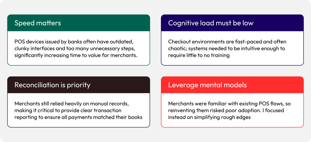
My focus was on aligning business goals with merchant workflows while designing within device constraints — ensuring the POS was both intuitive and practical in real retail environments.
Context-aware interface
Many merchants struggled with visibility when using compact devices in bright, sunny environments. They often resorted to squinting or shielding the screen with their hands to view it properly
I implemented both dark and light screen modes where appropriate, ensuring the interface remained clear and accessible in any lighting condition.
Time and device constraints
There was a real need to compromise on visual fidelity. Instead of high-polish graphics that could slow performance, I leaned into lightweight visuals, clear typography, and high-contrast layouts
One handed navigation
Because of how compact some devices were, users were fond of using one hand to operate them.
To compliment this, I also designed a logical layout that allows single thumb navigation
Cognitive load must be low
Checkout environments are fast-paced and often chaotic; systems needed to be intuitive enough to require little to no training
Key Decisions & Trade-offs
One of the biggest trade-offs I made was prioritizing performance over polish. Rich visual elements would have created a sleek look but risked lag on devices with low resolution and limited memory. Simplifying visuals allowed us to maintain fluid performance, which mattered more to merchants in high-pressure environments.
Collaboration & Challenges
One of the biggest challenges was specs misinterpretation during development. At some point, developers were coding with different unit standards (dp vs sp), resulting in inconsistent font sizes, padding, and layouts. This led to rework and sprint delays.
To solve this, I explored design-to-dev documentation and introduced the mini component library to standardize patterns. I also established design QA reviews before sprint delivery, catching issues early and reducing downstream rework.
Having the device also made usability testing easy as I always tested with real life merchants and got feedback in real time
The Neo experience
My aim was to craft and design an intuitive and smooth user flow from task discovery to completion. Each step in the process should be streamlined and predictable, reducing the need for frequent error recovery
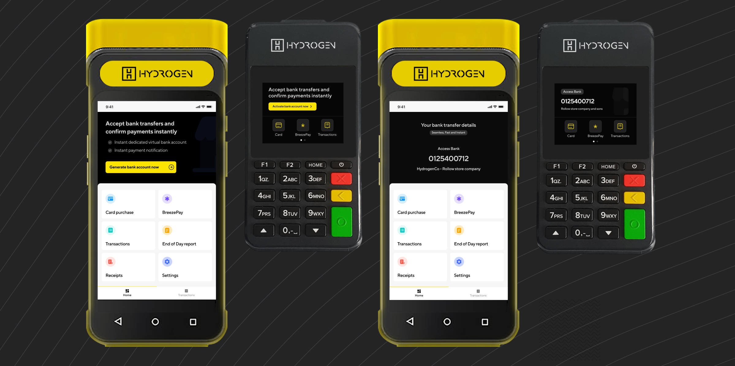
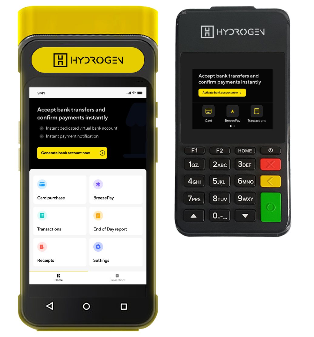
Home screen
I designed a home screen that put merchants’ most important tasks front and center – accepting card payments, viewing transactions, printing receipts, and generating end-of-day reports. Time-to-task completion was a key consideration, ensuring merchants could act quickly without navigating unnecessary steps.
To encourage adoption of our bank transfer service, I strategically placed the feature where merchants could clearly see its value.
Merchant impact: Faster task completion and stronger visibility into value-added services like bank transfers.
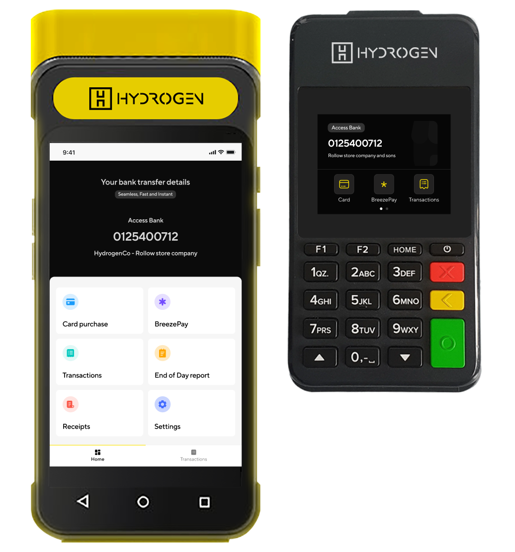
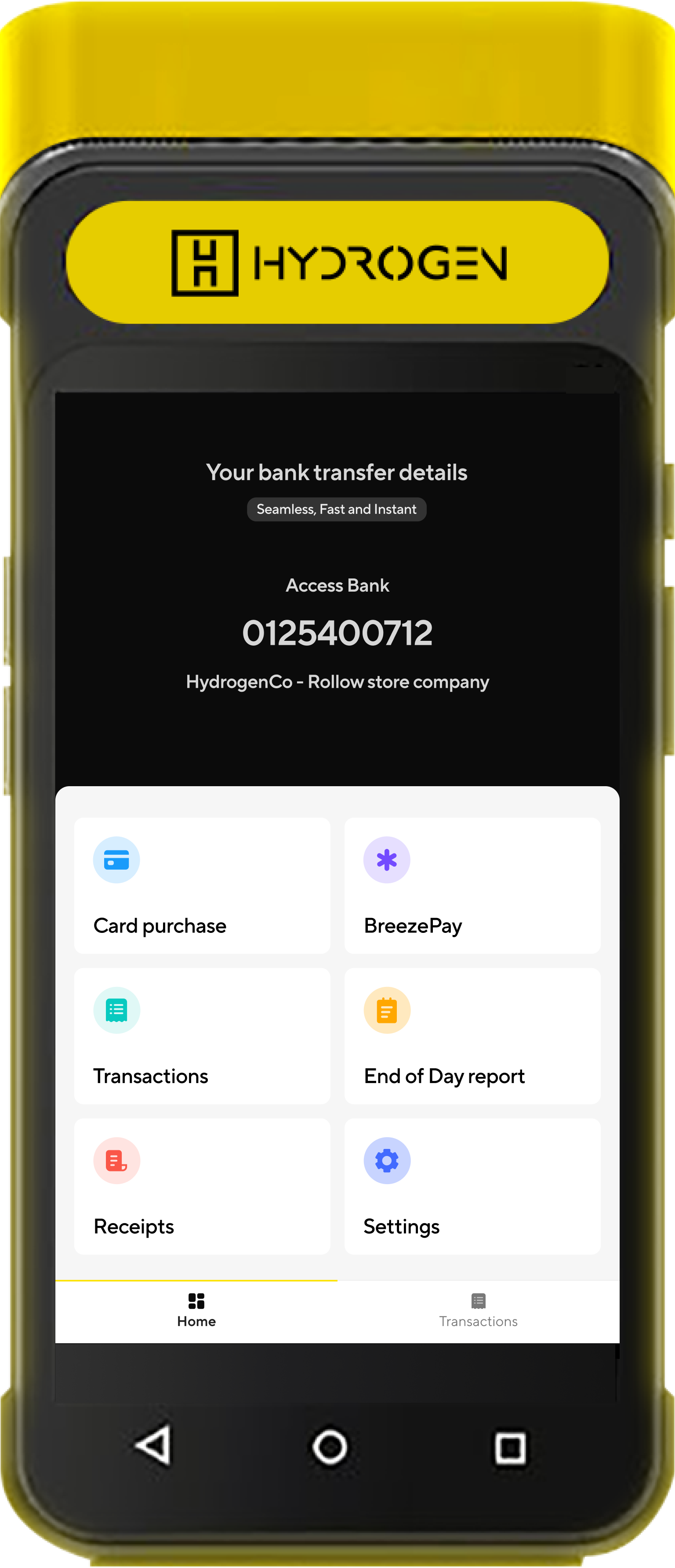
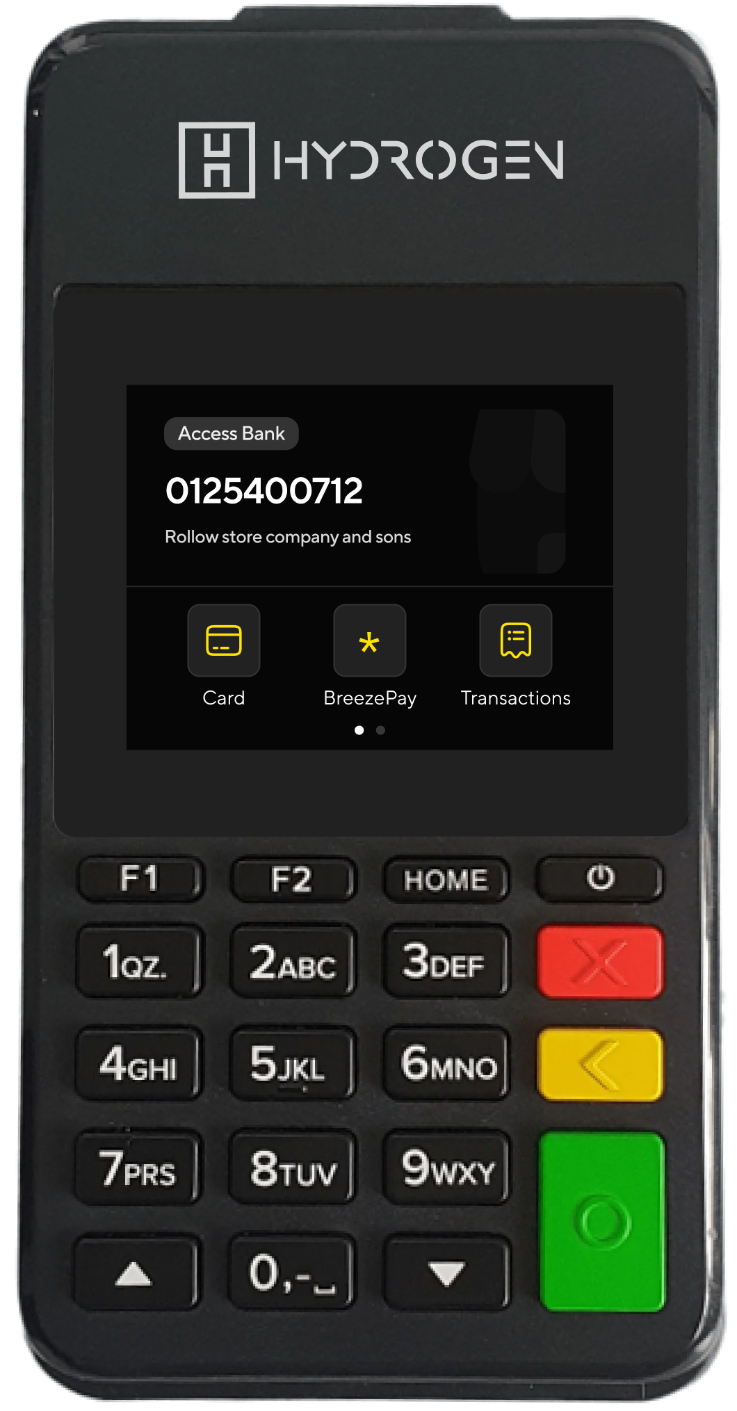
Virtual accounts in minutes
HydrogenPay POS empowers merchants to accept both card payments and bank transfers with minimal friction. With just a tap, merchants can instantly generate a virtual bank account for secure transfer collections from customers. This feature was powered by InstantPay- another product I led- ensuring a smooth integration between payment methods.
Merchant impact: Expanded payment options boosted customer convenience while driving higher transaction volumes for merchants
Expanded Card Transaction Options for Merchants
HydrogenPay POS equips merchants with advanced payment management tools such as issuing refunds and reversing transactions. These features not only aligned with industry standards but also gave merchants greater confidence and flexibility in handling disputes or errors- ensuring smoother customer experiences and stronger trust in the platform.
Transactions as they happen
Merchants can monitor and verify transactions in real time, reducing uncertainty and improving trust in the system. To further enhance usability, I designed streamlined search and filtering tools that made locating specific transactions quick and effortless- significantly improving the overall merchant experience.
Merchant impact: Improved transaction visibility and faster resolution when verifying payments.
End of Day report
I designed end-of-day reports that gave merchants a clear, structured view of all their transactions- mainly for reconciliation.
Design impact: Simplified reporting flows that improved transaction accuracy and gave merchants confidence when closing their business day
Receipt
I designed receipt-printing flows that let merchants quickly print the most recent transaction or retrieve a specific one via its RRN. This balanced everyday speed with reliable resolution in edge cases.
Design impact: Streamlined printing while supporting dispute resolution needs.
Results & Impact
The launch of Neo delivered measurable impact for Hydrogen and its merchants:
-
Support tickets dropped significantly, as common complaints from the old POS no longer applied.
-
Merchants processed transactions faster, reducing checkout times and improving customer satisfaction
-
Merchant adoption increased, with many preferring Neo over the legacy vendor POS.
-
Value-added services like richer transaction details and business reporting gave merchants better control of their operations.
-
Business independence improved, as Hydrogen no longer had to wait for vendor roadmaps or pay licensing fees—giving the company freedom to innovate at its own pace.
Reflection and key takeaways
I learned the power of immersive research. By embedding myself in merchant environments, I designed with empathy for their realities—speed, simplicity, and clarity in chaotic retail settings. That perspective shaped not only the product but also how I influenced engineering decisions when trade-offs arose.