Building Poseidon: A design system to help streamline product vision
Poseidon is a component library for Hydrogen Payment Service Company for building consistent web interfaces across all applications and offerings.
- Role: Product Designer, Design system contributor, Developer liaising
- Theteam: The design team, Dedicated design system engineer
- Year: 2024
💡 Background
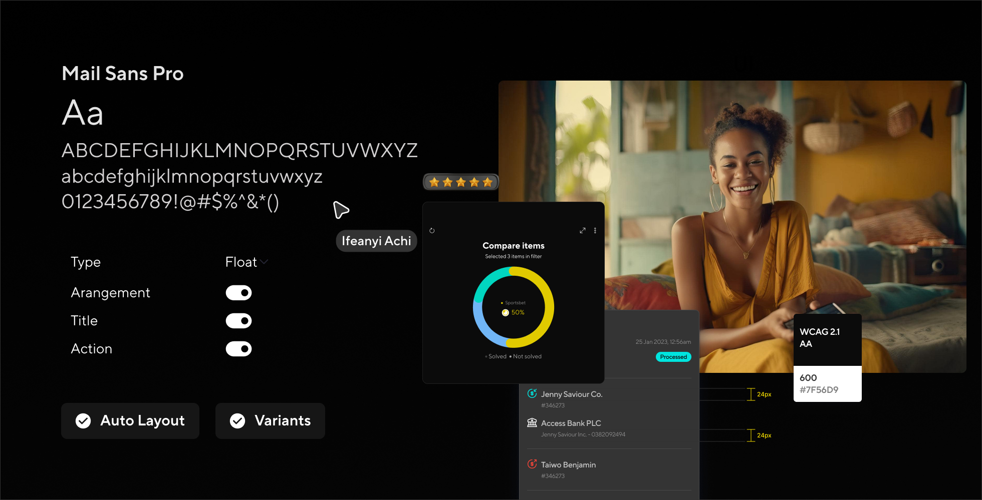
Like many startups, Hydrogen’s development philosophy favoured speed to market and operational autonomy. This created a lot of subtly different frontend designs and implementations. Over time, it led to a lot of disjointed user interfaces and user experiences which was having a huge negative impact on people who use our several products.
During a product review session, we encountered significant challenges due to a fragmented user experience across different projects and platforms including web, mobile and POS. We were also finding it difficult to maintain consistency in how we build products and also how we work internally as a product team.
I worked alongside a group of designers and developers to build a system that would turbo efficiency, improve consistency and user experience across all digital platforms.
Our goal was to develop a design system that would serve as a single source of truth for product teams when designing and implementing across all products and platforms.
📊 Key Metrics
55%
increase in workflow
7 hours
saved every week by the design system
40%
decrease in product development time
72%
increase in design consistency
Identifying Core Issues
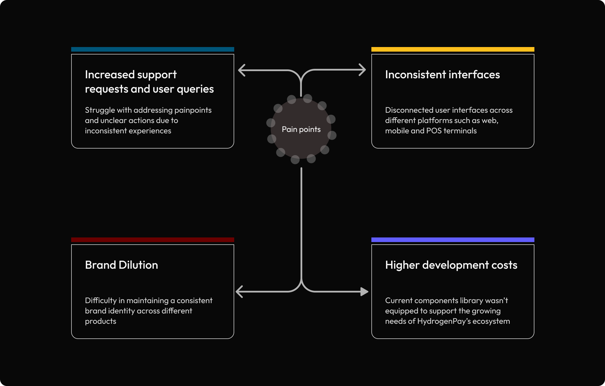
We carried out a cross-teams strategy workshop session where we were able to identify several pain points and their impact on the organization as well as internal operations. The teams included product, sales, marketing and customer success.
Feedback was also shared and documented
Establishing Goals and Processes
To address these challenges, we defined a set of core principles that would guide the redesign of our design system: consistency, efficiency and scalability.
Building a cohesive design system required close collaboration with other teams, particularly engineering and customer support. The engineering team provided valuable feedback on technical limitations, which helped us ensure the design system could be implemented without adding development complexities. Regular feedback loops allowed both design and development to move forward in alignment, reducing roadblocks and reinforcing our collective goals.
We used Figma as the central design tool, allowing for real-time collaboration and feedback
The atomic design approach
As a growing company, we didn’t have the time to stop and turn our design system into a large and complex project. Instead, we had to audit and turn our existing visual language into an organized system.
This process was twofold: First auditing our existing styles and elements, and then creating a consistent system to standardize our visual language as a strong yet flexible base.
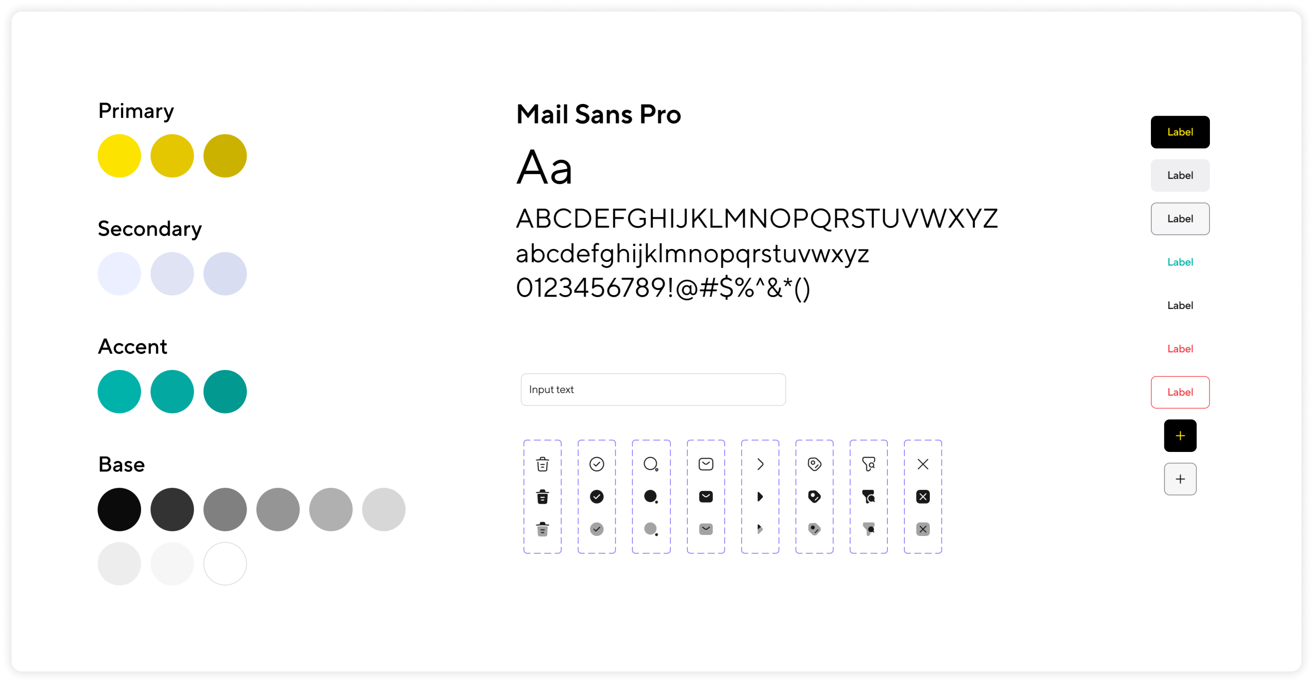
We adopted atomic design principles due to its modular approach in creating well structured design systems. By breaking down the UI into its smallest elements, we ensured that each element was adaptable. This not only improved consistency but also accelerated the design and development process.
We also implemented design tokens for consistent spacing, color, and typography, ensuring everyone worked from the same source of truth.
Components made for each other
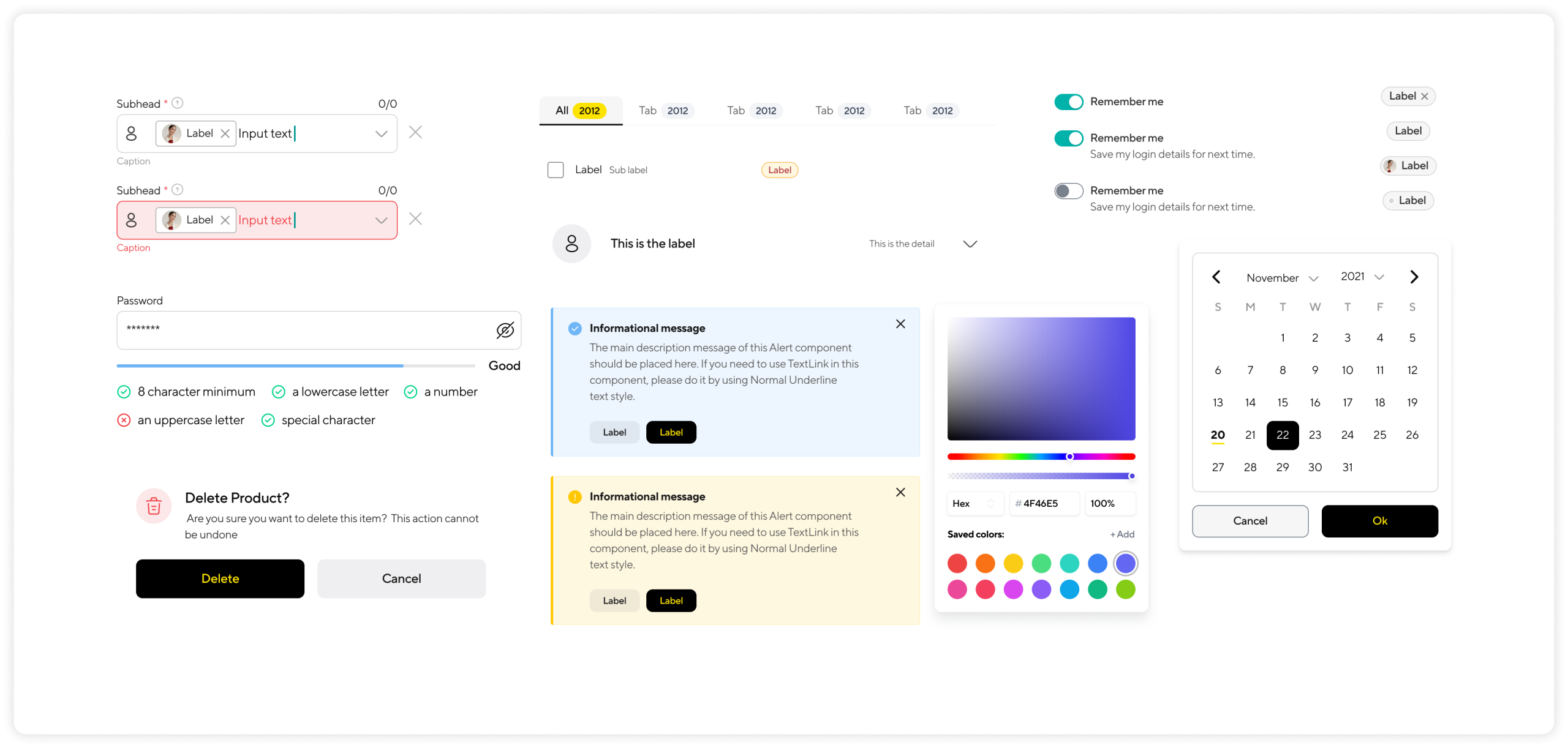
We iterated on existing components and also introduced new ones to match the needs of our products. It was not always easy as a major challenge was ensuring each component could be adapted to different platforms.
Theming
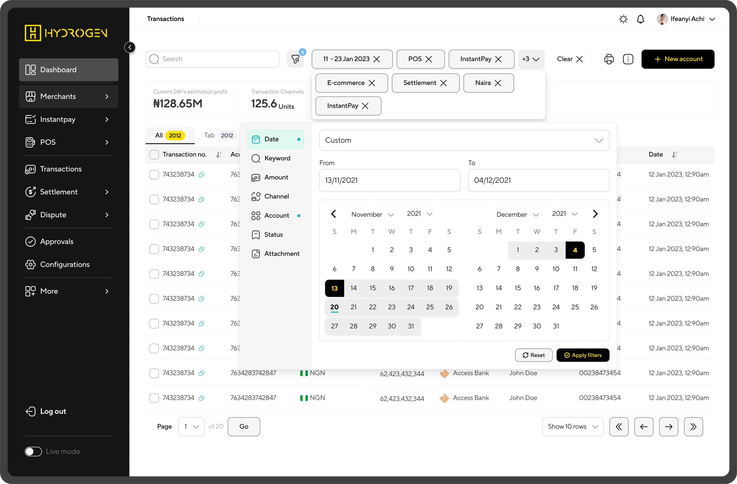
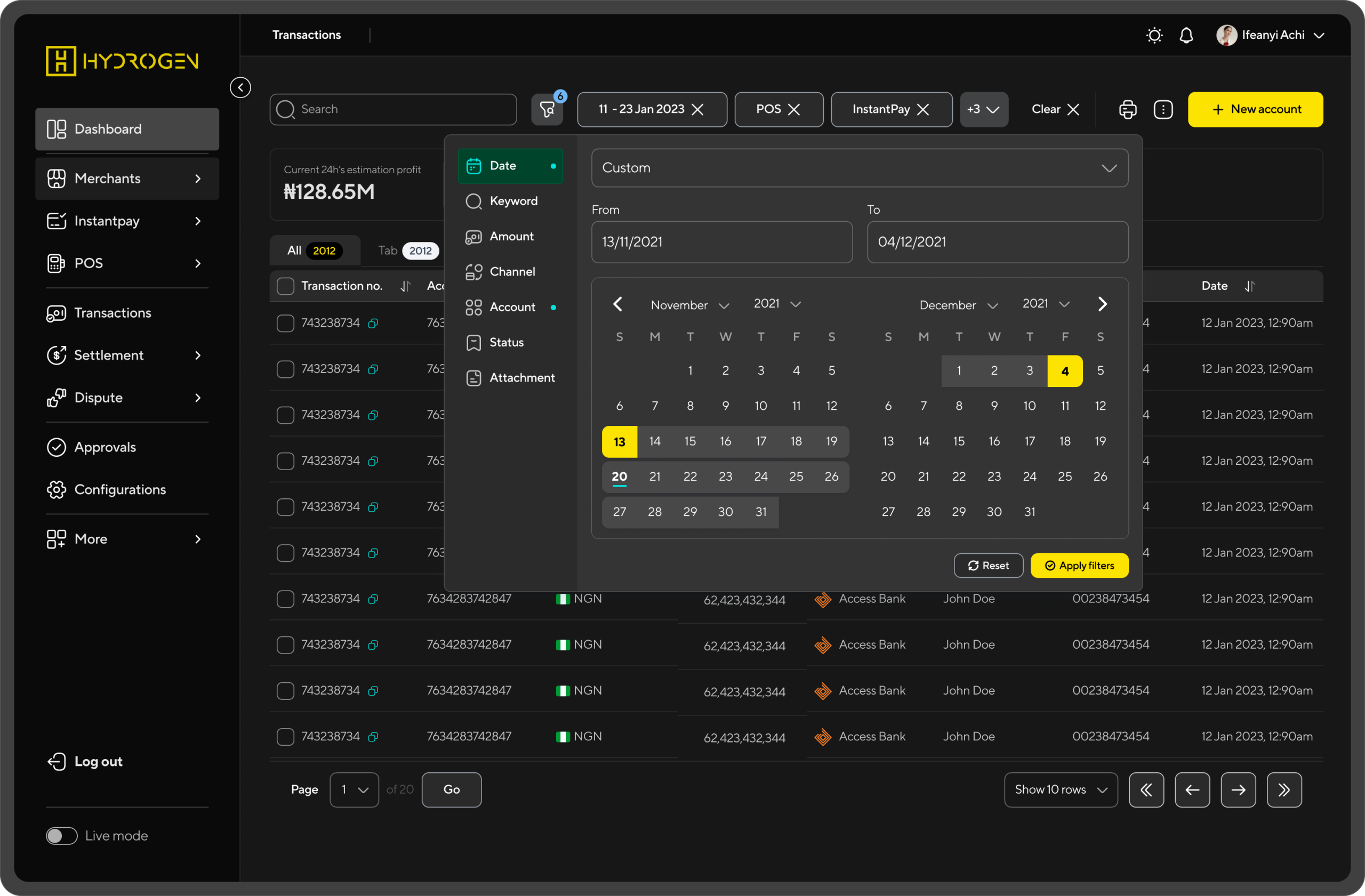
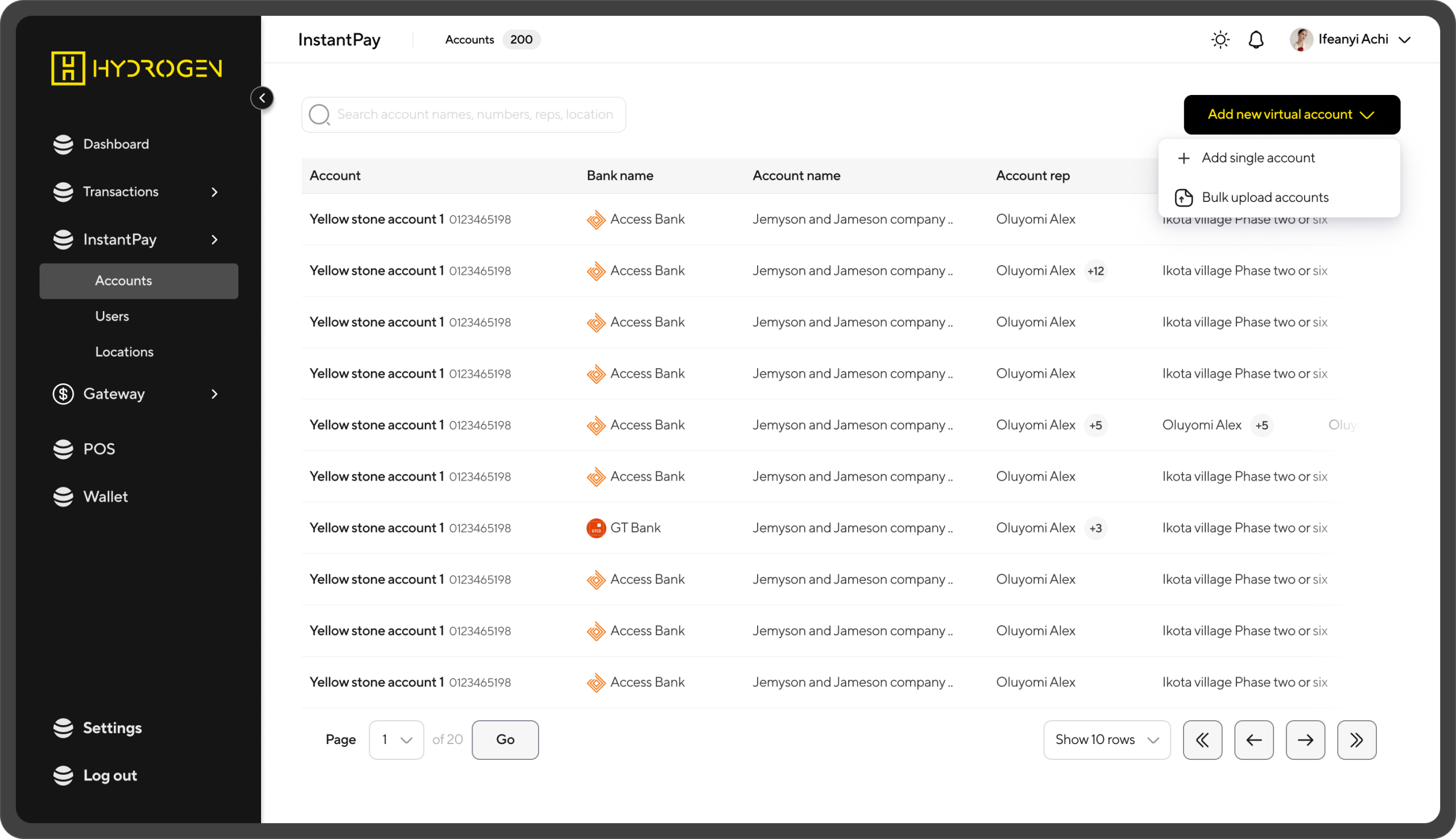
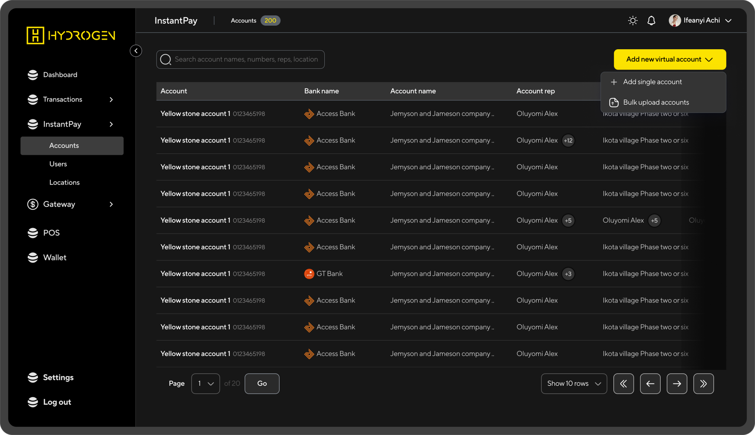
We also used variables and tokens to create light and dark versions, enabling us to expand branding as needed without compromising consistency.
The design system isn’t just a collection of components; it is a flexible and evolving ecosystem
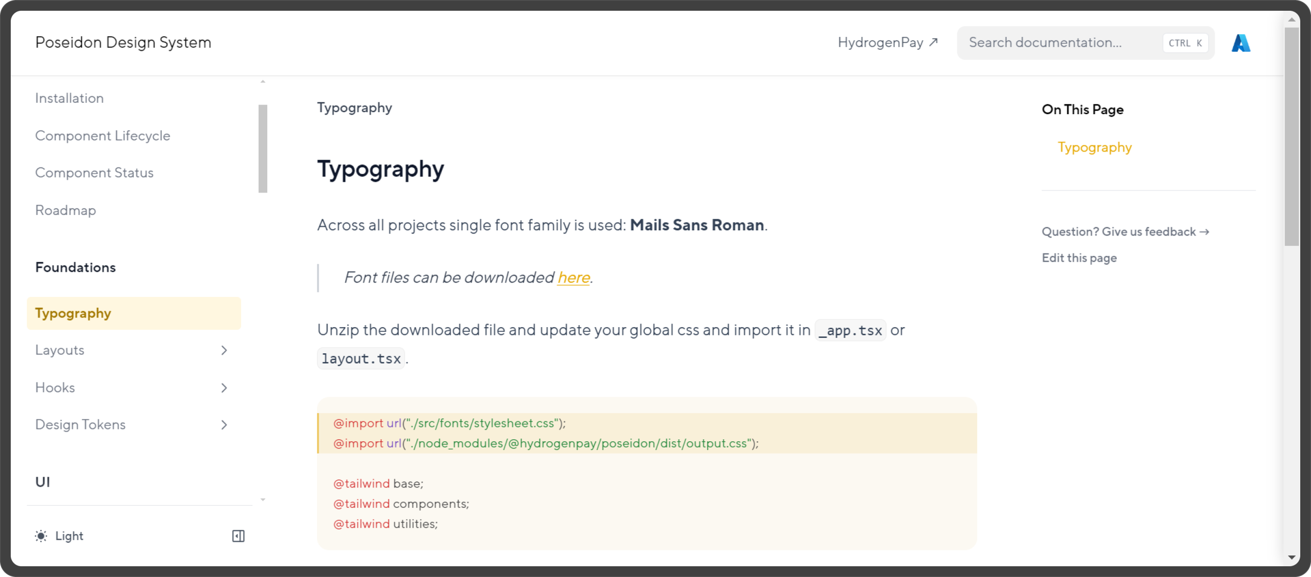
Documentation and discovery
We created docs that can be easily updated with every new component version release. No extra overhead, no complex processes, no outdated documentation.
The outcome was a flexible, organized, component library that streamlined workflows, reduced the likelihood of errors and provided easy access to reusable components that ensured consistency across all platforms
Impact and Result
We started seeing positive impact shortly after development commenced. We saw a significant reduction in development time and a significant increase in brand experience and design consistency. We also had less support queries centered around usability
Reflection
How well you understand a problem affects how often you need to address it. Repeated fixes can sometimes lead to reduced user trust, user experience and more technical debt. By working closely with stakeholders to understand their pain points and suggestions, I learned the value of different perspectives. This collaborative approach allowed us to create a seamless user experience more efficiently.
This project also reinforced how clear communication and the ability to effectively demonstrate how a design benefits different stakeholders and their needs, is essential for buy-in and adoption
